Ultramarine Blue vs Cerulean Blue: Which Should You Use?
Jun 30, 2026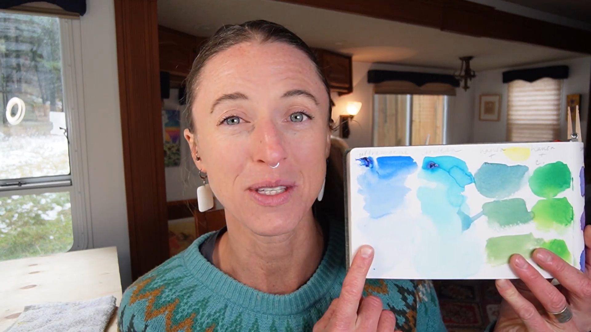
Walk into any art store and you'll quickly discover that there isn't just one blue paint. There are dozens: Ultramarine Blue, Cerulean Blue, Phthalo Blue, Prussian Blue, Cobalt Blue, and more. For many watercolor artists, especially beginners, they can all look surprisingly similar.
So when someone tells you to "just use blue," it's easy to assume any blue will do. Unfortunately, that's often where color mixing problems begin.
The truth is that the blue you choose has a huge impact on the colors you create. Choose the wrong blue and your mixtures may end up dull and disappointing. Choose the right one and your colors can become vibrant, luminous, and full of life.
Two of the most popular blues in watercolor are Ultramarine Blue and Cerulean Blue. While they may appear similar at first glance, they behave very differently. Understanding those differences can dramatically improve your color mixing.
Prefer to watch? Check out the full video below!
The Most Important Difference Between Ultramarine and Cerulean
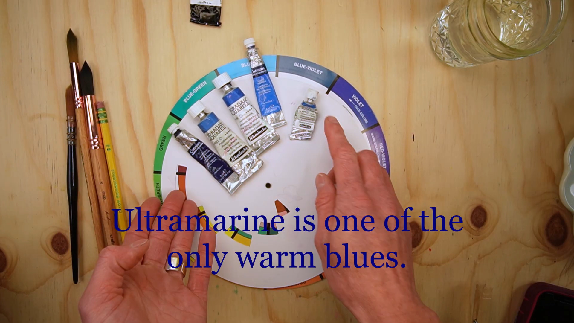
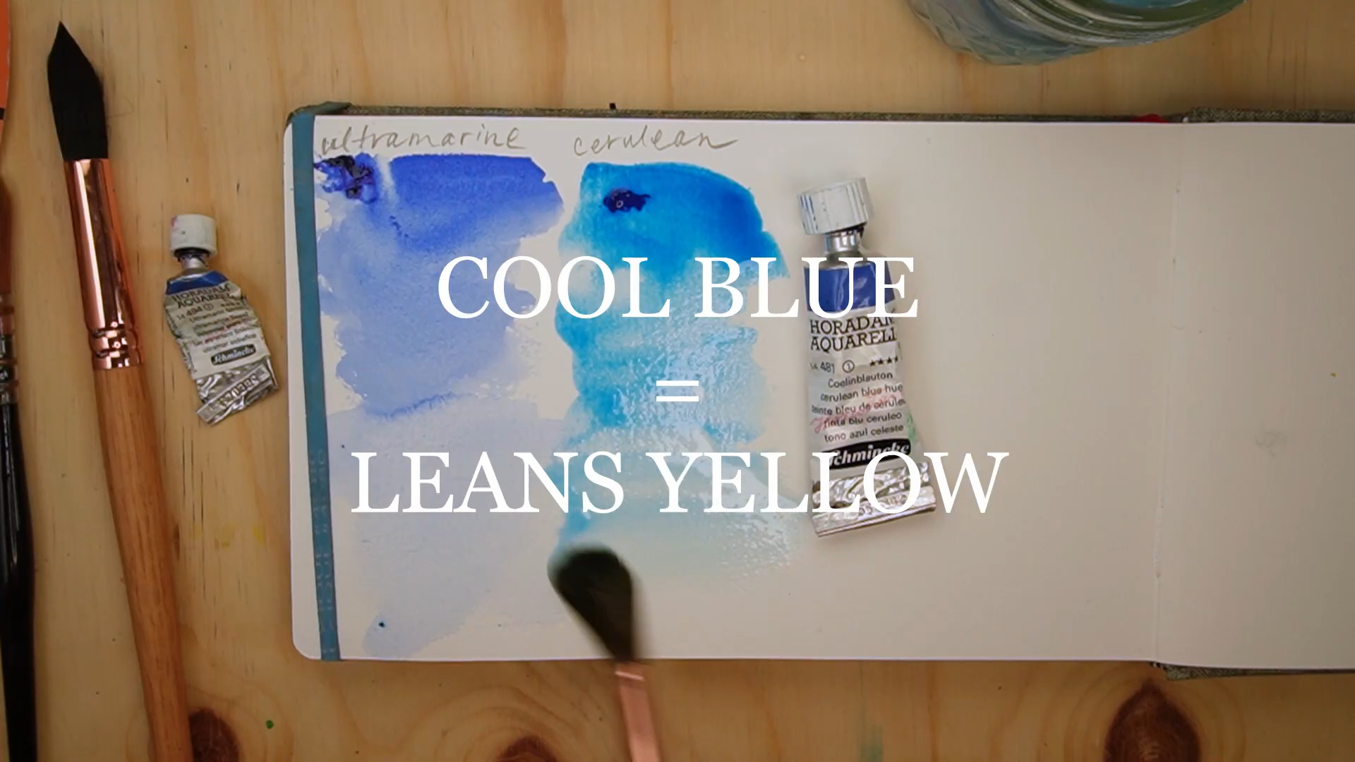
If you only remember one thing from this article, remember this: Ultramarine Blue is a warm blue. Cerulean Blue is a cool blue.
That single difference affects almost every color mixture you create. A warm blue leans toward red or purple. A cool blue leans toward yellow or green.
This concept is called color bias, and it explains why two blues can create completely different results when mixed with the same color. Ultramarine naturally wants to move toward purple. Cerulean naturally wants to move toward green.
Once you understand this, choosing the right blue becomes much easier.
Why These Blues Look Different
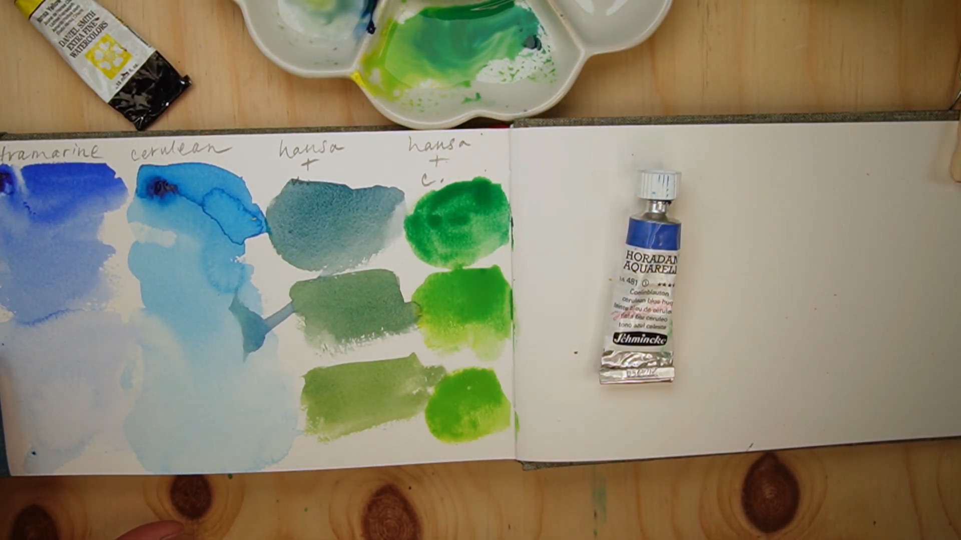
One of the easiest ways to spot color bias is by comparing paints side by side. Cerulean Blue often appears brighter, cleaner, and slightly greener. Ultramarine Blue appears deeper, richer, and slightly more violet.
For artists who are just beginning to study color theory, these differences can feel subtle. But once you train your eye to recognize them, you'll start seeing warm and cool blues everywhere. And that understanding becomes incredibly valuable when you're mixing colors.
Which Blue Creates Better Greens?
Let's imagine you're mixing green. Many artists automatically reach for whatever blue happens to be closest. But the results can vary dramatically.
When Cerulean Blue is mixed with a cool yellow, it produces a much brighter, cleaner green. That's because Cerulean already leans toward green. The pigments are working together.
Ultramarine Blue behaves differently. Because Ultramarine leans toward red, it introduces a subtle neutralizing effect into the mixture. The resulting green is often softer, duller, and more muted.
That doesn't mean it's bad. In fact, many landscape painters prefer these muted greens because they feel more natural. The key is understanding what you're trying to create.
If you want bright spring grass, Cerulean may be the better choice. If you want subdued forest greens, Ultramarine might serve you better.
Which Blue Creates Better Purples?
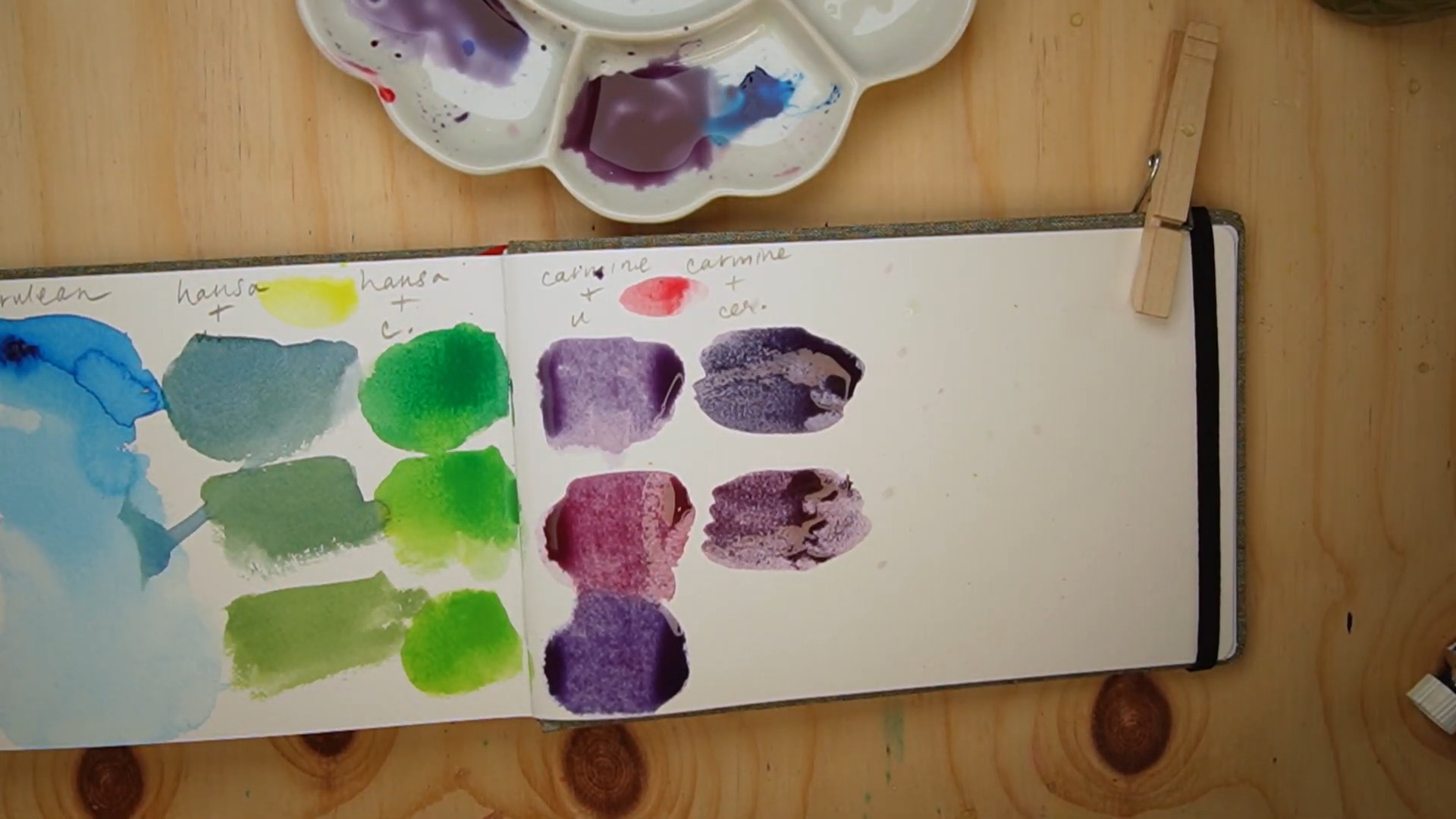
Now let's look at purple. This is where Ultramarine Blue truly shines. Because Ultramarine already leans toward red, it naturally works well with cool reds. Together, they create vibrant, rich purples. It's almost as if the colors are helping each other reach the destination.
Cerulean, on the other hand, leans away from red. When mixed with the same cool red, the resulting purple becomes noticeably more muted.
Again, this isn't necessarily a bad thing. Muted purples can be beautiful in shadows, distant landscapes, and atmospheric paintings. But if you're hoping for a bright, glowing violet, Ultramarine is usually the stronger choice.
Why So Many Artists Choose the Wrong Blue
One of the biggest mistakes watercolor artists make is choosing colors based on their names rather than their behavior. They know they need blue. So they grab a blue.
But successful color mixing starts by asking a different question: What color am I trying to create?
Instead of starting with the paint tube, start with the destination. If you want a vibrant green, choose a blue that naturally leans toward green. If you want a vibrant purple, choose a blue that naturally leans toward purple.
When you reverse-engineer your mixtures this way, color mixing becomes far more predictable, and far less frustrating.
Want a Quick Reference for Your Colors?
One of the hardest parts of color mixing is remembering how each pigment behaves once you sit down to paint. You might understand that Ultramarine is a warm blue and Cerulean is a cool blue, but when you're standing in front of your palette trying to mix the perfect green or purple, it's easy to second-guess yourself.
That's exactly why I created the Free Color Companion. It's a practical color-mixing reference designed to help you understand your pigments, identify color bias, and make more confident color choices while you paint.
Instead of relying on guesswork, you'll have a simple guide that helps you quickly see how your colors interact and which pigments are most likely to give you the results you're looking for.
👉 Get the Free Color Companion
The Best Blue Depends on What You Want to Mix
Artists often ask which blue is better: Ultramarine or Cerulean. The truth is that neither is objectively better. They simply serve different purposes.
Ultramarine excels when you want rich purples and more muted greens. Cerulean excels when you want vibrant greens and cleaner, brighter mixtures.
Understanding the strengths of each paint allows you to choose intentionally instead of relying on guesswork. And that's ultimately what color mixing is all about.
Final Thoughts: The Best Blue Depends on Your Goal
The next time you're standing in front of your palette, don't ask, "Which blue should I use?" Ask instead, "What color am I trying to create?" That small shift changes everything.
When you understand the color bias of your paints, you stop treating color mixing like a guessing game. You begin seeing why certain mixtures succeed, why others fall flat, and how to make choices that support the painting you're trying to create.
Because in watercolor, the best blue isn't the most popular one. It's the one that helps you get where you want to go.