Why Are My Watercolors Muddy? The Real Reason Your Colors Look Dull (And How to Fix It)
Jun 30, 2026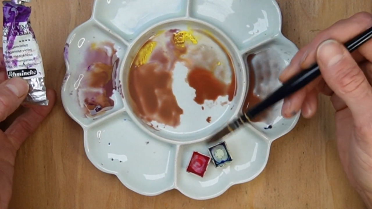
Have you ever mixed what should have been a beautiful, vibrant purple, only to end up with something brownish, gray, or strangely lifeless? If so, you're not alone. One of the most common questions beginner watercolor artists ask is: "Why are my watercolors muddy?"
Many painters assume muddy colors happen because they lack talent, don't have the right paints, or simply don't have a natural eye for color. Thankfully, none of those things are true. The real reason your watercolors look muddy has far less to do with artistic ability and much more to do with understanding how color actually works.
Once you understand a concept called color bias, you'll finally be able to predict your color mixes instead of hoping for the best. Let's dive in.
Prefer to watch? Check out the full video below!
What Does "Muddy Color" Actually Mean?
Before we talk about how to avoid muddy colors, we need to understand what "mud" actually is. Most painters use the word mud to describe any color they don't like, but there are actually two different kinds.
Type 1: Truly Muddy Color
This is the classic muddy mix. It's the unpleasant brown, gray-green, or murky color that appears when too many opposing colors are mixed together. Think of that ugly green-brown that seems impossible to use anywhere in a painting.
Type 2: A Dull Color in the Wrong Context
This type surprises many painters. Imagine you're trying to mix a bright, glowing purple for a flower, and instead you create a muted purple. The color itself isn't bad. In fact, that same muted purple might work beautifully in a shadow area or a distant mountain.
The problem isn't the color. The problem is that it isn't the color you intended. When a color is less vibrant than expected, we often label it muddy, even though it's simply a neutralized version of the color.
Understanding this distinction matters because not all dull colors are mistakes. Professional artists intentionally use muted colors all the time. The goal isn't to eliminate dull colors. The goal is to create them intentionally.
Four Quick Fixes for Muddy Watercolors
Before we get into the deeper color theory, here are a few practical issues that commonly create muddy watercolor paintings.
1. Use Clean Water
It sounds obvious, but dirty water creates dirty color. If your rinse water looks like coffee, your colors won't stay vibrant for long. Fresh water helps your pigments remain clean and luminous.
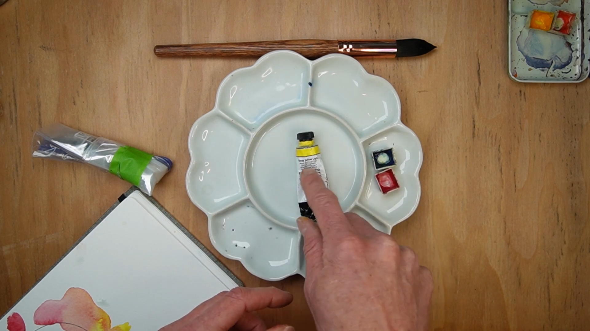
2. Clean Your Palette
Many artists avoid cleaning their palette because they don't want to waste paint. Unfortunately, leftover paint from previous sessions can contaminate fresh mixes. A clean palette makes a surprising difference in color clarity.
3. Let Layers Dry Completely
One of the easiest ways to create accidental mud is by adding paint before a previous layer has dried. Wet paint mixing with partially dry paint often creates unintended results. Patience pays off.
4. Limit Your Mixtures
As a general rule, try not to mix more than three colors together. Every additional pigment introduces complexity and increases the likelihood of creating dull or muddy mixtures. When in doubt, simplify.
The Real Reason Your Watercolors Look Muddy
Now let's get to the most important concept. The biggest reason watercolor artists struggle with muddy colors is because they don't understand color bias. Once you understand color bias, color mixing becomes dramatically easier.
What Is Color Bias?
Most artists learn that the color wheel contains three primary colors: red, yellow, and blue. While this is technically true, it leaves out a crucial detail. Each primary color actually exists on a spectrum.
There are warm reds and cool reds, warm yellows and cool yellows, and warm blues and cool blues. In other words, not all reds are the same red. And those differences have a huge impact on your color mixtures.
Warm Colors vs. Cool Colors
A warm color leans toward its warm neighbor on the color wheel, while a cool color leans toward its cool neighbor. A warm red leans toward yellow, appearing slightly orange-red. A cool red leans toward blue, appearing slightly violet-red.
The same principle applies to every primary color. Once you begin seeing these subtle color biases, your understanding of color mixing changes completely.
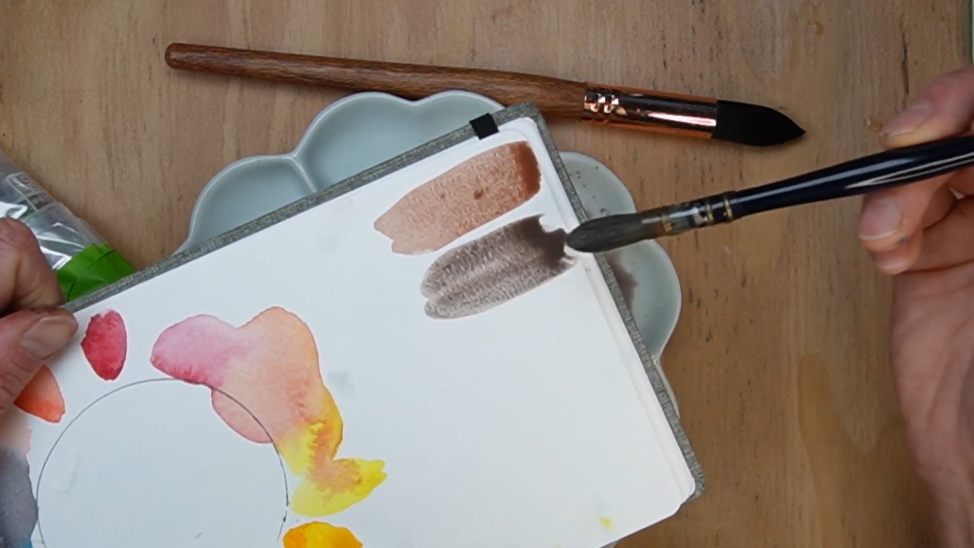
Why Some Purples Look Bright and Others Look Muddy
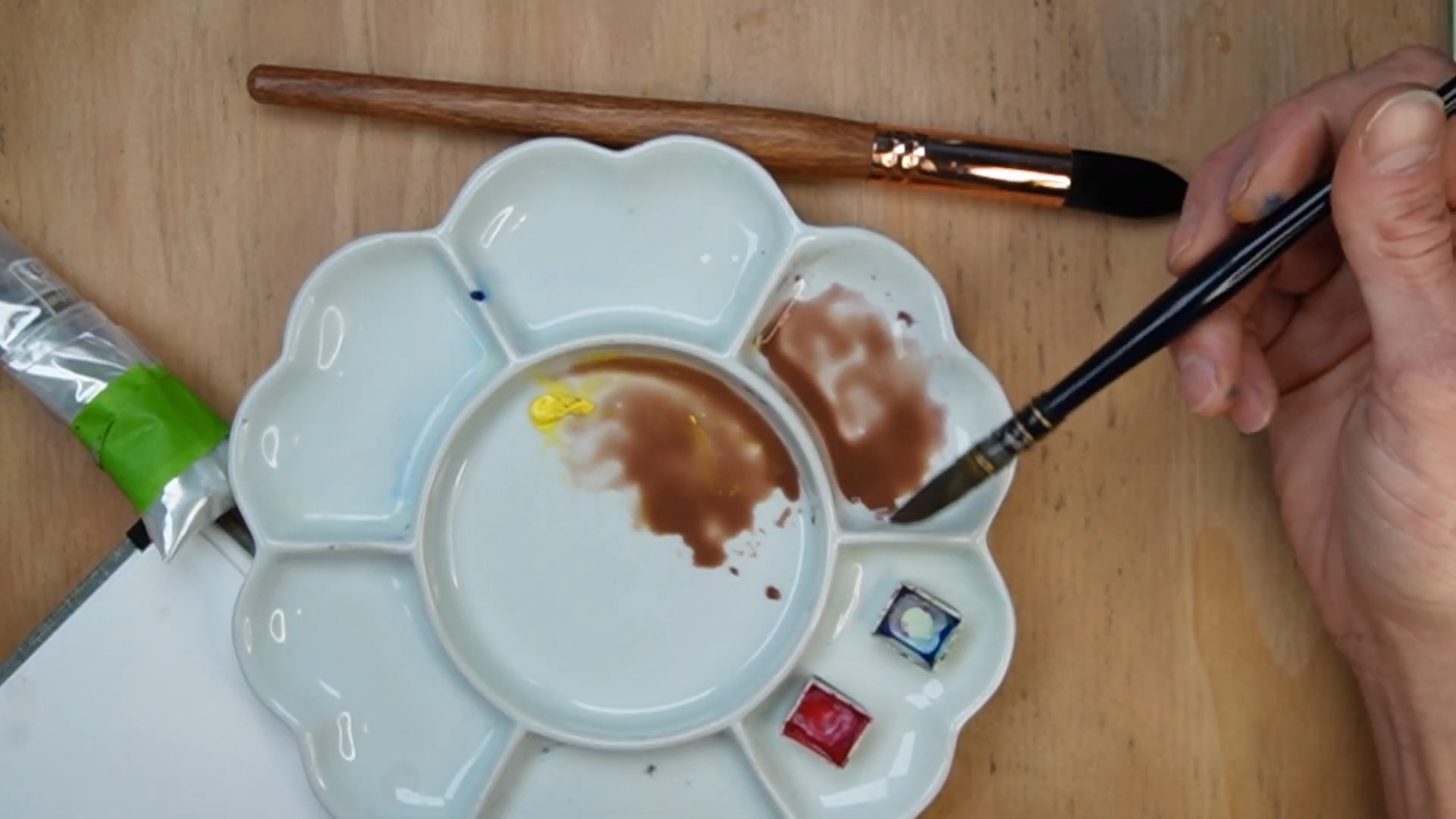
Suppose you want to mix a vibrant purple. The easiest approach is to choose a red that leans toward blue and a blue that leans toward red. Both colors are already moving toward purple, so they cooperate. The result? A rich, vibrant, saturated mixture.
Now imagine using a warm red that leans toward orange and a blue that leans toward green. Neither color is moving toward purple, and the result is a much duller mixture. This is where many artists get frustrated, assuming they're doing something wrong. In reality, they simply selected pigments with opposing color biases.
Why Does This Happen?
The answer lies in complementary colors - colors that sit opposite one another on the color wheel, like red and green, blue and orange, and yellow and purple. When complementary colors mix together, they neutralize each other.
A green-biased blue contains a hint of green, and since green is complementary to red, some of the red gets neutralized. Similarly, an orange-biased red neutralizes some of the blue. The result is a duller, grayer mixture. This is why certain color combinations produce brilliant results while others create muted colors.
How to Mix Vibrant Watercolors Every Time
If you want brighter color mixtures, look for colors that lean toward each other.
For Bright Purple, use:
- Cool red
- Red-biased blue
For Bright Orange, use:
- Warm red
- Orange-biased yellow
For Bright Green, use:
- Cool yellow
- Yellow-biased blue
Notice the pattern? Both colors are naturally moving toward the secondary color you're trying to create. That's the secret.
How to Intentionally Mix Muted Colors
Once you understand color bias, you can create muted colors on purpose. Instead of accidentally making dull colors, you can control exactly how vibrant or neutral a mixture becomes.
This is incredibly valuable because most paintings need both. Professional painters often reserve their brightest colors for focal points and use more neutral colors elsewhere, creating a painting with balance, depth, and visual hierarchy.
How Do I Identify the Color Bias of My Paints?
The easiest method is to compare your paints side by side. Ask yourself: Does this red look slightly orange or slightly purple? Does this yellow lean toward orange or green? Does this blue lean toward green or purple?
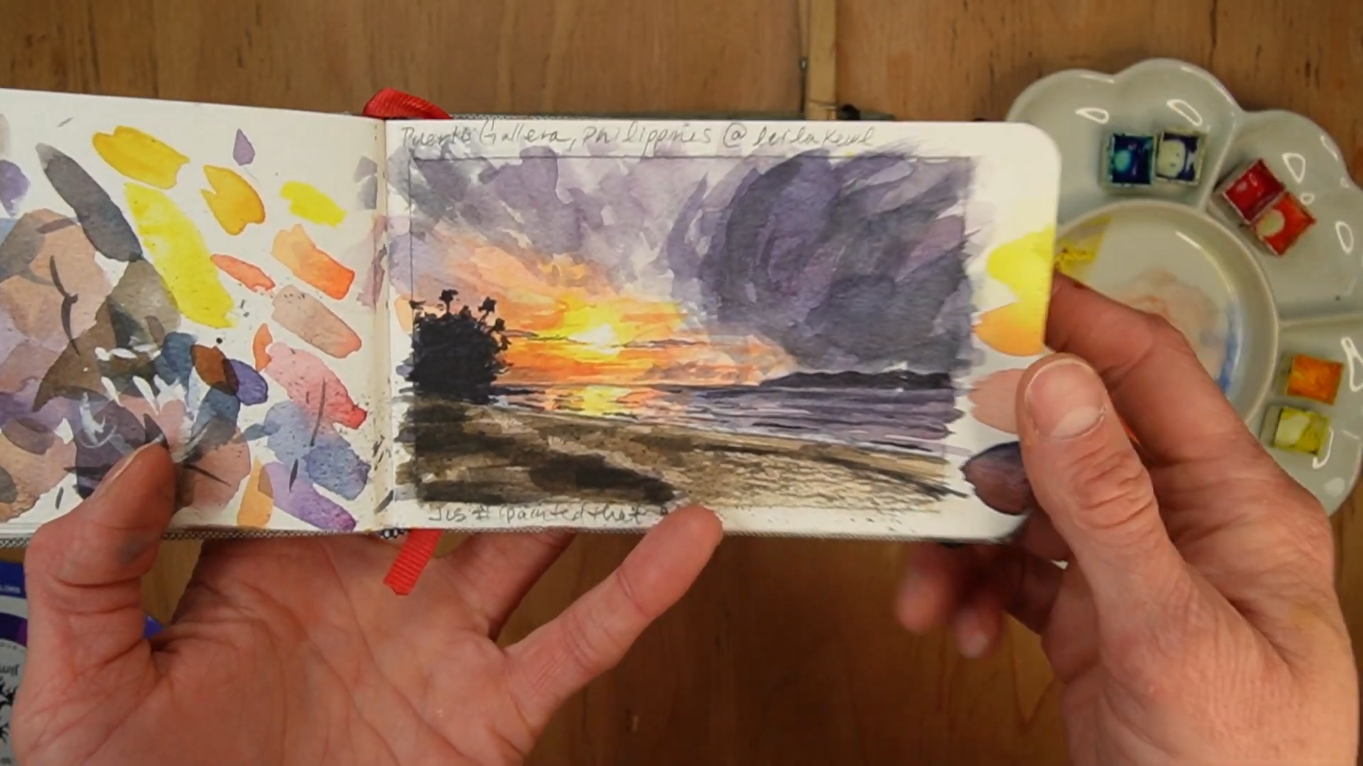
Creating color wheels and mixing charts with your own paints is one of the fastest ways to train your eye. You'll start to see how every pigment behaves and which combinations give you the results you want.
Why Learning Color Bias Changes Everything
Many artists spend years thinking color mixing is random. They hope a mixture turns out well and cross their fingers every time they pick up a brush. Color bias changes that.
When you understand how pigments lean and interact, color mixing becomes predictable. You stop guessing. You stop wasting paint. You stop wondering why your colors don't match what you imagined. And painting starts feeling playful again.
Want to See This in Action?
Understanding color bias is one thing. Seeing how different reds, yellows, and blues behave when mixed is where the real breakthrough happens. Many artists struggle with muddy colors not because they lack talent, but because nobody ever showed them why certain combinations stay vibrant while others go dull.
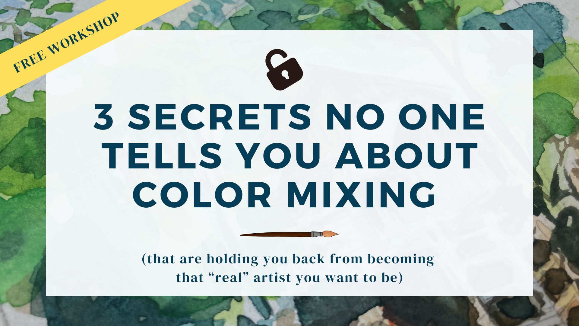
In my Free Color Mixing Workshop, I walk through three color mixing secrets most artists never learn, including how to identify color bias, avoid muddy mixes, and create cleaner, more predictable results. If color mixing has ever felt confusing, frustrating, or random, I'd love to show you a simpler way.
👉 Join the Free Color Mixing Workshop
Final Thoughts: Muddy Colors Are Usually a Knowledge Problem, Not a Talent Problem
If your watercolors look muddy, don't assume you're bad at painting. Most artists simply haven't been taught how color bias works. Once you understand that every primary color has a warm and cool version, everything starts making sense:
- Why some color mixtures glow
- Why others feel dull
- Why certain pigments work beautifully together
- Why others create unexpected neutralization
The good news is that color mixing isn't magic. It's a skill. And like any skill, it gets easier once you understand the underlying principles. The next time you find yourself wondering, "Why are my watercolors muddy?" take a closer look at the color bias of the paints you're mixing. The answer is probably hiding there.