Why the White Parts of Your Watercolor Paintings Feel Dull
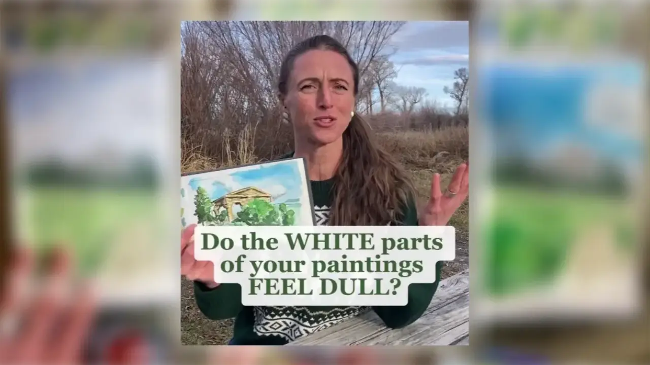
If the white parts of your watercolor painting feel dull, the problem is often the colors around them. When the surrounding colors are too timid, the white has nothing to stand out against. Make those colors bolder and the white pops.
Why This Matters
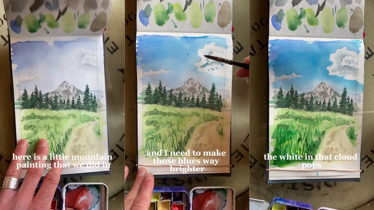
White paper left unpainted should read as the brightest part of a painting, but a white area only looks bright next to something stronger. In a mountain painting with a white cloud, for example, the cloud still felt dull because the blue sky around it was far too timid. Watercolor also dries a lot lighter than it looks when you first put it on, so layers that seem strong while wet often end up too light, and you may need to go over them again.
If the colors around a white are too timid, the white looks dull, so be bolder with your colors and your saturation. Making that sky a much deeper blue made the white cloud look far more brilliant. It also matched the reference photo, where the cloud was the brightest thing.
Try This
- Look at the white areas that feel dull, then check the colors around them.
- If those colors look timid or too light, go over them again once the paint has dried, with a darker and more saturated color.
- Compare the white before and after.
Remember that watercolor dries lighter than it looks, so needing a second layer is normal.
Want to Go Deeper?
If you'd like more on keeping the light in your paintings, you may find this related Quick Tip helpful. It looks at how to preserve a highlight, which goes hand in hand with making your whites pop:
Watercolor Light and Shadow: How to Preserve a Highlight
Ready to Keep Building Your Landscape Skills?
The mountain painting used as the example here comes from my Free Beginner Watercolor Class, which is a good place to keep building your skills.
👉 Join the Free Beginner Watercolor Class
If you're curious about my overall approach to teaching watercolor, you can find that on my about page.